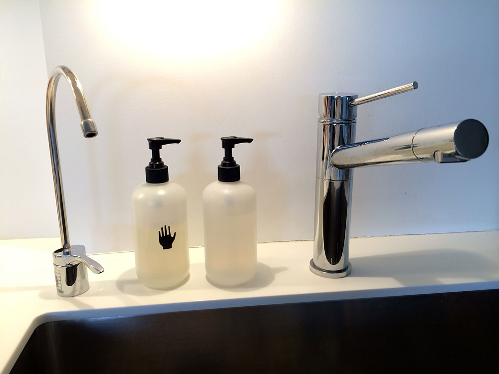
We don’t like seeing labels on things we have around the house — there’s enough advertising in our world; we don’t need it at home — so we routinely peel them off. At the kitchen sink, we fill plain, unmarked bottles with dish soap and hand soap. Even when we had two very differently-shaped bottles, with one seeming obviously dishwashing liquid, guests would ask “Which is for hands?”.
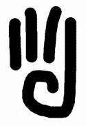
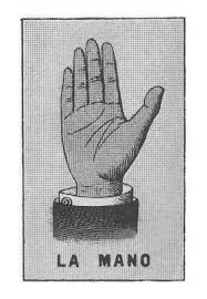
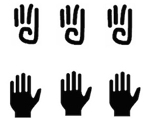
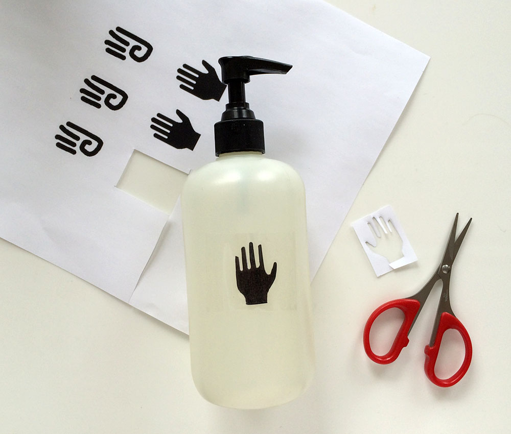
So we decided to make a word-free sign for the hand soap. We peeled the label off our pump bottle of fragrant Mrs. Meyer’s Clean Day Liquid Hand Soap (endlessly refillable from a big 33-ounce bottle). Then we hunted around the internet for pleasing symbols of “hand”…
…
…
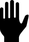
…and compiled our favorites on a single printable page using Photoshop.
Next we just cut one out and afixed it with a wide swath of packing tape.
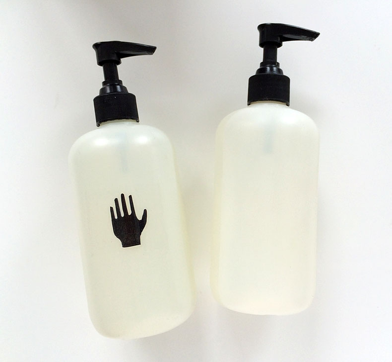
Voila: HAND soap.
We’re going to see if it gives our guests the message (even with our shift to keeping the dish liquid dispenser more conveniently sitting hidden in the sink, rather than by the faucet.)
Stay-tuned.
And now that we think about it, SYMBOLS rather than words are a pleasing way to label just about anything, along the lines of using polaroids and other images to indicate what’s inside.


Brilliant!!
I wholeheartedly agree with you! You certainly took it a step forward with the quiet hand! Love it..
I really like the hand symbol, it’s clean and clear, but find in general I am symbol illiterate. I over think the meaning and then it means nothing to me. Elevator open/close symbols are the worst. Does indicate doors open (they’re big and in the way ands are pushed back to nothingness) or close (they move from nothing to being big and in the way)? Either way, I never use them anymore because I’m always pushing the wrong one .
You might want to try some Scotch Book Tape by 3M #845. Amazing stuff, I use it for projects all the time and have for many years. I very much enjoy your website.
Hmm. Never heard about this stuff. Why do you like it? Waterproof etc?
Curious. I hadn’t realized it until you brought it up, I NEVER seem to be able to “read” the open/close symbols in elevators AND have seem other riders struggling as well. Which to my thinking means that IT IS A SERIOUSLY FLAWED DESIGN.
One of my secret pleasures is checking out symbols to see if they really do communicate well…I’ve seen the most effective and elegant ones in Finland.